
Color Consultation · Sacramento & Bay Area
Paint Color Consultation in Sacramento, CA
Designer-led paint color consultations covering undertones, finish pairings, and sampling plans for cohesive spaces.
- Sacramento, established
- 2018
- Estimate turnaround
- 24 hr
What’s included
The work, at a glance
On-site session
60-90 min walkthrough
Whole-home palette
Interior + exterior
Sample boards
Drawn-down, not chips
Cabinet + trim
Coordinated finishes
Why us
Why Professional Color Consultation?
Investing in professional color consultation services saves time, money, and the frustration of living with paint colors you regret. The average homeowner looks at 20-30 paint swatches before making a decision, yet nearly 40% report dissatisfaction with their final choice. This happens because small paint chips don't accurately represent how colors appear on walls under different lighting conditions throughout the day.
Our paint color consultants bring expertise in understanding undertones—the subtle hints of color beneath the surface that can make a "gray" look purple, green, or blue depending on your lighting. These undertones interact with natural light, artificial lighting, flooring, furniture, and architectural features in ways that aren't obvious from a 2-inch paint sample. We assess all these factors during your consultation to recommend colors that work beautifully in your specific environment.
Professional color consultation also helps you create cohesive whole-home palettes that flow seamlessly from room to room. Rather than treating each space as an isolated project, we develop coordinated color schemes that unify your home while allowing each room its own character. This approach increases your home's value and creates a more sophisticated, designer-quality result.
For homeowners preparing to sell, our color selection expertise focuses on neutrals and tones with broad appeal that help buyers envision themselves in the space. The right paint colors can increase perceived home value by 2-5% and reduce time on market significantly. Our consultants stay current on color trends while recommending timeless choices that won't feel dated in a few years.
Whether you're paralyzed by too many choices, worried about making expensive mistakes, or simply want professional guidance to achieve the perfect look, our color consultation services provide the expertise and confidence you need to transform your space with the ideal paint colors.
Our Color Consultation Services
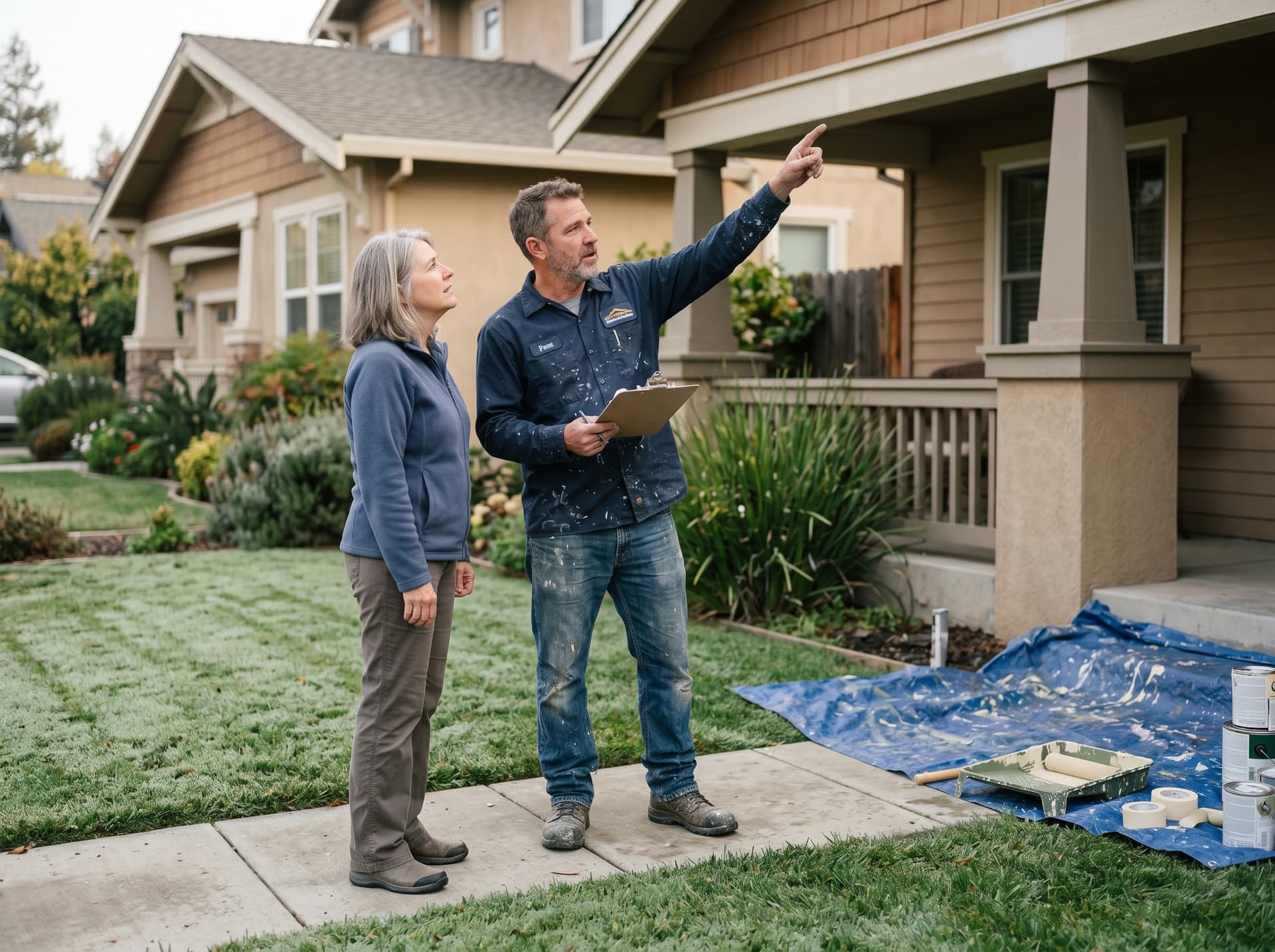
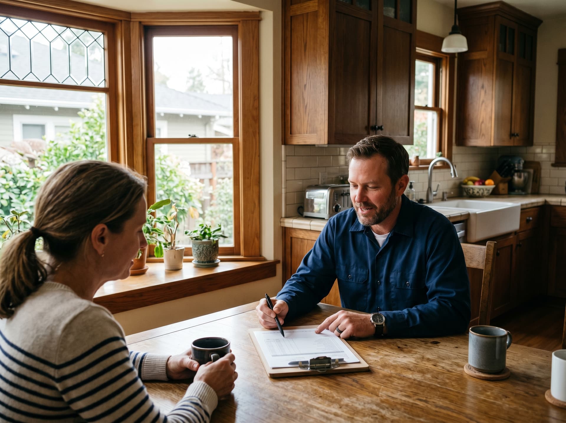
In-Home Color Consultation
Our in-home color consultation service brings expert paint color advice directly to your Sacramento property. During this comprehensive 90-minute session, your dedicated color consultant evaluates your space in person, examining how natural light moves through rooms at different times of day, assessing existing elements like flooring and cabinetry, and understanding your style preferences and functional needs.
We bring physical paint samples, fan decks, and large color swatches to test against your walls, furniture, and lighting conditions. This hands-on approach reveals how colors truly appear in your specific environment—something impossible to achieve from online browsing or small store samples. Your consultant photographs colors in your space and provides detailed notes on recommended shades for walls, trim, ceilings, and accent areas.
In-home consultations are ideal for complex projects like whole-home repaints, challenging lighting situations, coordinating with expensive finishes like granite or hardwood, or when you want the confidence of seeing colors in your actual space before committing to paint.
Virtual Color Consultation
For clients who prefer convenience or are in the planning stages of their project, our virtual color consultation services deliver expert paint color advice through video calls. You'll share photos of your spaces, discuss your goals and preferences, and receive personalized color recommendations tailored to your needs.
Virtual consultations work beautifully for straightforward projects, second opinions on colors you're considering, or when you've already narrowed choices to a few finalists. Your consultant provides a detailed color plan with specific paint names, brands, and sheens, plus guidance on testing samples in your space. This affordable option gives you professional expertise without the scheduling constraints of an in-home visit.
Exterior Color Consultation
Exterior color schemes require specialized expertise to balance curb appeal, architectural style, neighborhood context, and Sacramento's bright California sunshine. Our exterior color consultation services help you select coordinated colors for siding, trim, doors, shutters, and accent elements that enhance your home's architectural features while complementing the surrounding landscape.
We consider factors like roof color, stonework, landscaping, and neighborhood aesthetics to ensure your exterior paint colors feel cohesive and appropriate. Whether you're refreshing your current scheme or completely transforming your home's exterior appearance, we guide you toward choices that increase curb appeal and property value.
Whole-Home Color Planning
Creating a unified color flow throughout your entire home requires strategic planning and an understanding of how spaces connect visually. Our whole-home color planning service develops a comprehensive palette that allows smooth transitions from room to room while giving each space its own identity.
We map out main wall colors, coordinating accent options, trim and ceiling recommendations, and strategic color placements that guide the eye and create visual interest. This holistic approach ensures your home feels cohesive and professionally designed, with colors that work together harmoniously while reflecting your personal style throughout.
The Color Consultation Process
1. Discovery & Goals
Every successful color consultation begins with understanding your vision, lifestyle, and practical needs. We start by asking detailed questions about how you use each space, who lives in the home, your style preferences, and what you hope to achieve with your paint color selection. Are you creating a calming retreat, an energizing workspace, or preparing your home for sale?
We also discuss any challenges you've experienced with previous paint colors, elements you love or dislike in your current spaces, and your timeline and budget. This discovery phase ensures our recommendations align perfectly with your goals rather than simply suggesting trendy colors that might not suit your needs.
2. Lighting Assessment
Lighting dramatically affects how paint colors appear, making this the most critical factor in successful color selection. During your consultation, we assess both natural and artificial lighting in each space. North-facing rooms receive cool, indirect light that can make colors appear darker and more muted. South-facing rooms enjoy warm, bright light that intensifies colors throughout the day.
We examine how morning, afternoon, and evening light changes the appearance of colors in your specific rooms. We also evaluate your artificial lighting—LED bulbs, incandescent fixtures, or fluorescent lights each cast different tones that interact with wall colors. Understanding these lighting conditions prevents the common problem of colors looking perfect in the store but completely wrong on your walls.
3. Color Palette Development
Based on our discovery conversation and lighting assessment, we develop a customized color palette tailored to your space. We consider existing fixed elements like flooring, countertops, cabinetry, and furniture that must coordinate with your new paint colors. Our consultants use professional color theory knowledge to identify undertones and create harmonious combinations.
We typically present 3-5 color options for each area, explaining the reasoning behind each choice and how they'll appear under your specific lighting conditions. We consider factors like room size (lighter colors expand small spaces while darker hues add coziness to large rooms), ceiling height, architectural details, and the mood you want to create.
4. Large Sample Testing
Small paint chips lie—they simply don't provide enough surface area to accurately judge how a color will look on your walls. We strongly recommend testing large samples (at least 2' x 2' sections) of your top color choices directly on your walls. We guide you on where to place these samples to see colors under different lighting conditions throughout the day.
Live with your samples for at least 48 hours, observing how they look in morning light, afternoon sun, evening artificial light, and on cloudy days. This testing phase prevents costly mistakes and gives you confidence in your final selections. We're available to answer questions and provide guidance as you evaluate your samples.
5. Final Recommendations
After you've tested samples and made your final decisions, we provide a comprehensive color plan document. This includes specific paint names and numbers, recommended brands and finishes, where each color should be applied, and coordination notes for trim, ceilings, and accent walls.
We also include application tips, approximate coverage calculations, and suggestions for complementary colors in adjacent spaces. This detailed roadmap ensures your painting project proceeds smoothly, whether you're hiring ProFlow Painting for professional application or tackling the project yourself.
Understanding Color Theory
Undertones Explained
Every paint color has undertones—subtle hints of other colors beneath the dominant hue. A beige might have pink, yellow, or gray undertones. A gray could lean blue, green, purple, or brown. These undertones become more apparent on walls and interact significantly with your lighting and existing elements.
Understanding undertones is crucial for successful color selection. A gray with blue undertones might clash with warm oak flooring, while a gray with brown undertones coordinates beautifully. Our color consultants are trained to identify these subtle undertones and predict how they'll appear in your specific space, preventing the common frustration of colors looking completely different than expected once applied.
Warm vs Cool Colors
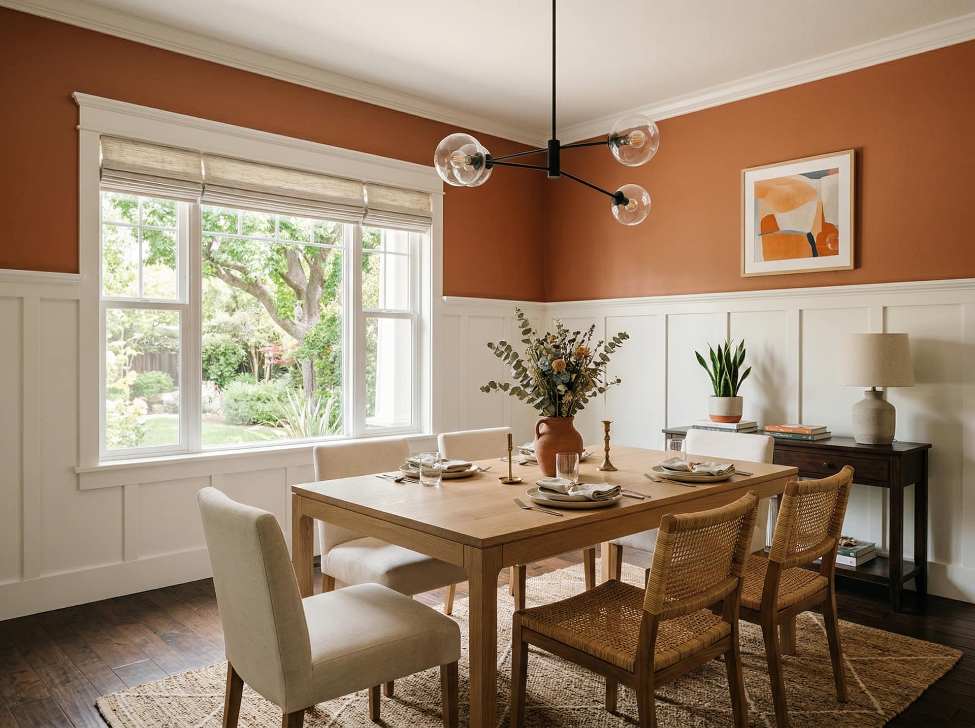
Warm colors include reds, oranges, yellows, and colors with red or yellow undertones. These hues create energizing, cozy, and inviting atmospheres. They work beautifully in social spaces like living rooms, dining rooms, and kitchens. Warm colors also make large rooms feel more intimate and welcoming.
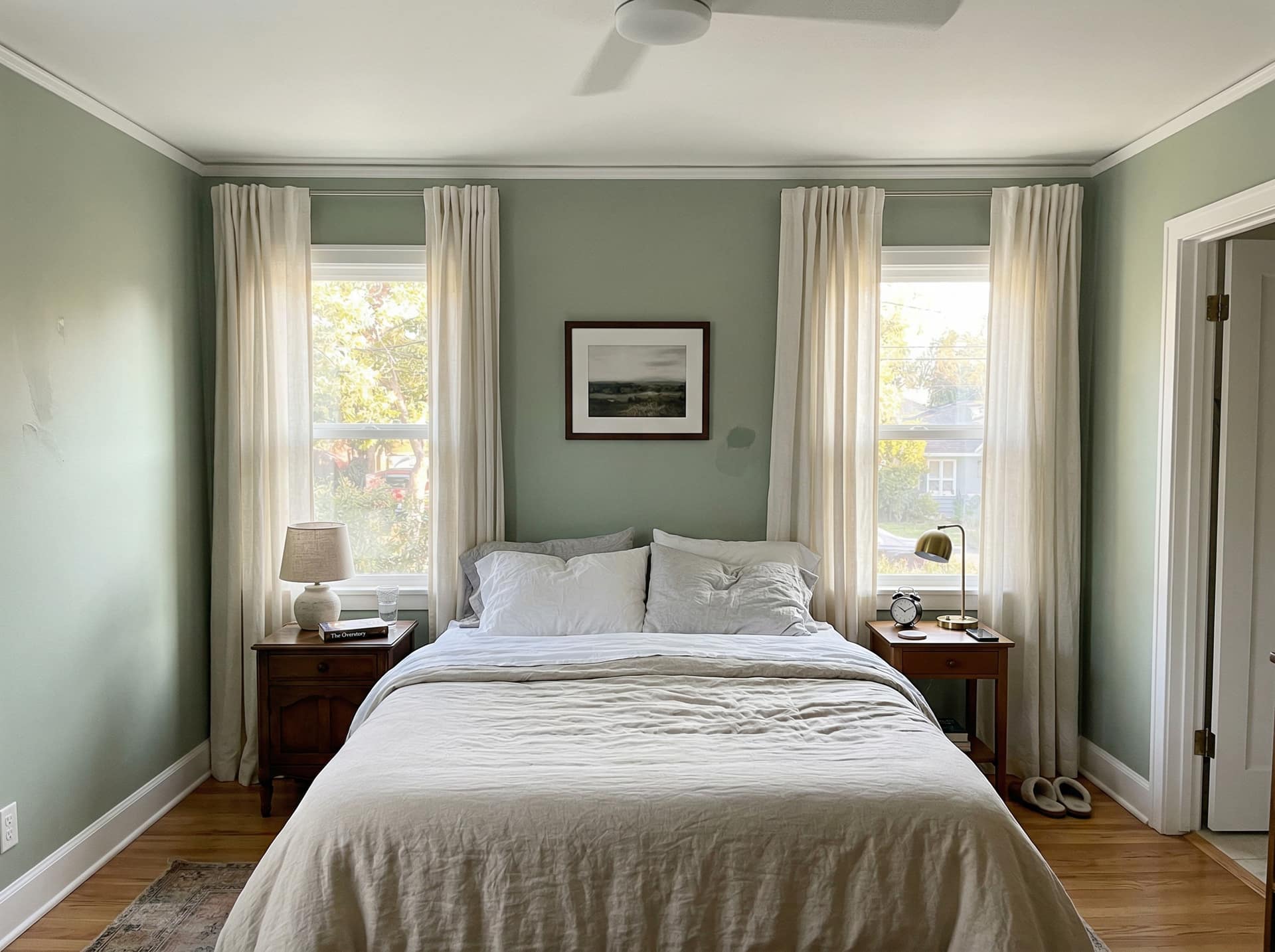
Cool colors encompass blues, greens, purples, and colors with blue undertones. These shades promote calmness, relaxation, and concentration. They're ideal for bedrooms, bathrooms, and home offices. Cool colors also make small spaces feel larger and more open. Understanding whether your space benefits from warm or cool tones helps narrow your options significantly and creates the desired mood.
Creating Flow Between Rooms
Successful whole-home color schemes create visual flow between connected spaces while allowing each room distinct character. We achieve this by using colors from the same family or palette, varying intensity rather than switching color families abruptly, or using a consistent neutral throughout with different accent colors in each room.
The goal is smooth transitions when you move from space to space—colors should feel related rather than jarring. We consider sightlines between rooms, ensuring colors that are visible simultaneously work harmoniously together. This creates a cohesive, professionally designed feeling throughout your home.
Accent Wall Strategies
Accent walls add visual interest and dimension without overwhelming a space with bold color. The key is selecting the right wall—typically the focal point wall where the eye naturally goes when entering the room. This might be the wall behind your bed, the fireplace wall, or the wall at the end of a long hallway.
For accent wall success, choose a color that's 2-3 shades darker or lighter than your main wall color, or select a complementary bold color that appears in your decor elements. Avoid painting walls with windows as accent walls, as the color will be broken up and lose impact. Our consultants help you identify the perfect accent wall location and color combination for maximum impact.
Popular Color Trends
2024/2025 Trending Colors
The latest color trends emphasize natural, earthy tones that bring warmth and tranquility into homes. Warm terracottas, sage greens, and rich clay tones reflect our collective desire to connect with nature. These organic hues create calming environments while adding sophisticated depth to interiors.
Soft, muted pastels are replacing the stark grays that dominated recent years. Think dusty rose, pale sage, warm sand, and creamy whites with subtle undertones. These colors offer the neutrality homeowners desire while adding more warmth and personality than cool grays.
Bold jewel tones like deep emerald, sapphire blue, and rich burgundy are popular for accent walls, front doors, and statement spaces. These dramatic colors add luxury and personality when balanced with neutral surroundings. In Sacramento's sunny climate, these rich colors create beautiful contrast against our bright outdoor light.
Timeless Neutrals
While trends come and go, certain neutral colors remain classic choices that never look dated. Warm whites and creamy off-whites provide a fresh, clean backdrop that works with any decor style. Unlike stark white, these softer shades add warmth without yellowing or feeling dingy.
Warm grays with beige or greige (gray-beige) undertones offer versatility and sophistication. These balanced neutrals coordinate beautifully with both warm and cool accent colors, making them ideal for main living areas. They provide more interest than basic beige while maintaining broad appeal—especially important for homes being prepared for sale.
Soft taupes and warm beiges create inviting, comfortable spaces that feel collected and timeless. These colors work particularly well in Sacramento homes, complementing our natural surroundings and bright California light. They provide a neutral foundation that allows furniture, artwork, and architectural details to shine.
Bold Accent Choices
For homeowners ready to embrace color, strategic bold accent choices create personality and visual interest. Deep navy blues add sophistication to dining rooms, home offices, and libraries. This rich color feels both classic and contemporary, working beautifully with metallic accents and both traditional and modern furniture.
Forest and emerald greens bring nature indoors, creating serene yet dramatic spaces. These colors work particularly well in bedrooms and bathrooms where you want a spa-like retreat feeling. Pair with natural wood tones and brass fixtures for a luxurious, organic aesthetic.
Warm terracotta and burnt orange tones add energy and warmth to social spaces. These earthy, Mediterranean-inspired colors feel especially at home in California, complementing our indoor-outdoor lifestyle and abundant sunshine.
California-Inspired Palettes
Sacramento's location in Northern California inspires color palettes that reflect our natural environment. Desert-inspired tones—warm sands, terracottas, sage greens, and sky blues—bring the outdoor landscape inside while coordinating beautifully with our climate and light quality.
Coastal-influenced palettes featuring soft blues, warm whites, sandy beiges, and seafoam greens create airy, relaxed spaces that feel distinctly California. These colors reflect our laid-back lifestyle while maintaining sophistication.
Wine country hues including deep plums, rich burgundies, warm olives, and golden yellows celebrate Sacramento's proximity to Napa and Sonoma. These sophisticated colors add depth and elegance to dining rooms, wine rooms, and entertaining spaces.
Frequently Asked Questions
How much does a color consultation cost?
ProFlow Painting offers color consultation services starting at $150 for a virtual consultation and $250 for a 90-minute in-home consultation. However, when you schedule painting services with us, we credit the full consultation fee toward your project cost, making the consultation essentially free. This investment saves you from costly color mistakes that could require repainting entire rooms—a mistake that easily costs $500-1,500 per room in wasted materials and labor. Our clients consistently report that professional color consultation was the best investment in their painting project, giving them confidence and results they love.
How do I choose paint colors for an open floor plan?
Open floor plans require strategic color selection to define different zones while maintaining visual flow. We recommend using variations of the same color family—perhaps a medium tone in the main living area, a lighter shade in the dining space, and the lightest version in the kitchen. This creates subtle definition without jarring transitions. Alternatively, use one consistent neutral throughout with different accent colors in each zone introduced through decor, furniture, and accent walls. Our consultants assess your specific floor plan and lighting to recommend the approach that best suits your space, ensuring cohesive flow while allowing each area its own identity.
Should I paint my ceiling the same color as my walls?
Painting ceilings the same color as walls creates a cocoon-like, enveloping effect that can make rooms feel more intimate and cohesive. This technique works beautifully in bedrooms, powder rooms, and small spaces where you want a cozy, sophisticated atmosphere. The lack of contrast between walls and ceiling makes the boundaries disappear, which can actually make small rooms feel larger. However, in spaces with beautiful architectural details, standard-height ceilings, or where you want a more traditional look, keeping ceilings white or a lighter shade than walls is often preferable. Our color consultants assess your ceiling height, room size, architectural features, and desired atmosphere to recommend the best approach for each space.
What are the best paint colors for selling a house?
The best paint colors for selling a house are warm, inviting neutrals with broad appeal that help buyers envision their own belongings in the space. Soft warm whites, light grays with warm undertones, and greige (gray-beige) combinations consistently appeal to the widest range of buyers. Avoid bold, trendy, or highly personalized colors that might turn off potential buyers. For Sacramento's real estate market, we recommend colors like Benjamin Moore's Revere Pewter, Sherwin-Williams' Agreeable Gray, or Behr's Swiss Coffee—timeless neutrals that photograph well, work with various decor styles, and create a fresh, move-in-ready appearance. Our color consultants understand local buyer preferences and can recommend the optimal palette to maximize your home's sale potential.
How many paint samples should I test?
We recommend testing 2-3 paint samples maximum per room to avoid analysis paralysis. Testing too many options makes comparison difficult and prolongs the decision-making process unnecessarily. During your color consultation, we narrow your choices to the most promising options based on your space's specific conditions. Purchase sample sizes of these finalists and paint large sections (at least 2' x 2') on different walls to see how colors look under various lighting conditions. Observe your samples for at least 48 hours, noting how they appear in morning light, afternoon sun, and evening artificial light. This focused testing approach provides the information you need to make confident decisions without the overwhelm of comparing six or eight different shades.
Can you help me match existing colors in my home?
Absolutely! Color matching is a common service we provide. If you love a color from another room, a piece of fabric, or even inspiration from a magazine or Pinterest, we can identify the closest paint match. For existing wall colors, we can use color-matching technology to identify the exact shade or find the closest equivalent in your preferred paint brand. However, keep in mind that colors can look different in different rooms due to lighting variations, so what works beautifully in your south-facing living room might not look the same in your north-facing bedroom. Our consultants help you adapt colors appropriately for each space's unique conditions while maintaining the cohesive look you desire throughout your home.
Sacramento Color Consultation Experts
ProFlow Painting has been Sacramento's trusted color consultation expert since 2015, helping hundreds of homeowners and businesses discover paint colors that transform their spaces beautifully. Our certified color consultants understand how Sacramento's bright California sunshine, seasonal light changes, and local architectural styles influence color selection. We stay current on the latest color trends while respecting timeless design principles that ensure your choices remain beautiful for years to come.
Whether you're overwhelmed by paint color options, preparing your home for sale, or simply want professional expertise to achieve the perfect look, our color consultation services provide the guidance and confidence you need. We serve the entire Sacramento region including Roseville, Folsom, El Dorado Hills, and surrounding communities.
Ready to discover your perfect paint colors? Contact ProFlow Painting today at (916) 740-7249 to schedule your color consultation. Let our experts help you choose colors you'll love living with for years to come.
Pricing factors
What drives the price of color consultation in Sacramento
Every estimate is line-item — no flat-rate guessing. These variables move the number on your project, in order of how much they typically affect total cost.
Session type (in-home vs. virtual)
In-home sessions include travel time and on-site sampling; virtual sessions are shorter and lower cost.
Number of rooms or surfaces
Each additional room or exterior elevation extends session time and the number of sample applications.
Complexity of existing conditions
Homes with unusual lighting, bold existing colors, or high-contrast furnishings take longer to analyze.
Sample material costs
Large-format wall samples use actual paint product — more rooms mean more sample quarts.
Whole-home vs. single-room scope
Whole-home palette coordination requires evaluating sightlines and transitions between every space.
How it goes
Four steps. No surprises.
Step 01
Consult
On-site walkthrough. Scope, substrates, and timing — no upsell.
Step 02
Estimate
Written line-item bid within 24-48 hours. Products specified.
Step 03
Paint
Daily PM updates. Two coats minimum. Protected floors and landscaping.
Step 04
Walkthrough
Signed punch list. Touch-ups before we pull tape. Paint cans labeled.
Room breakdown
Every room we paint, and what changes between them
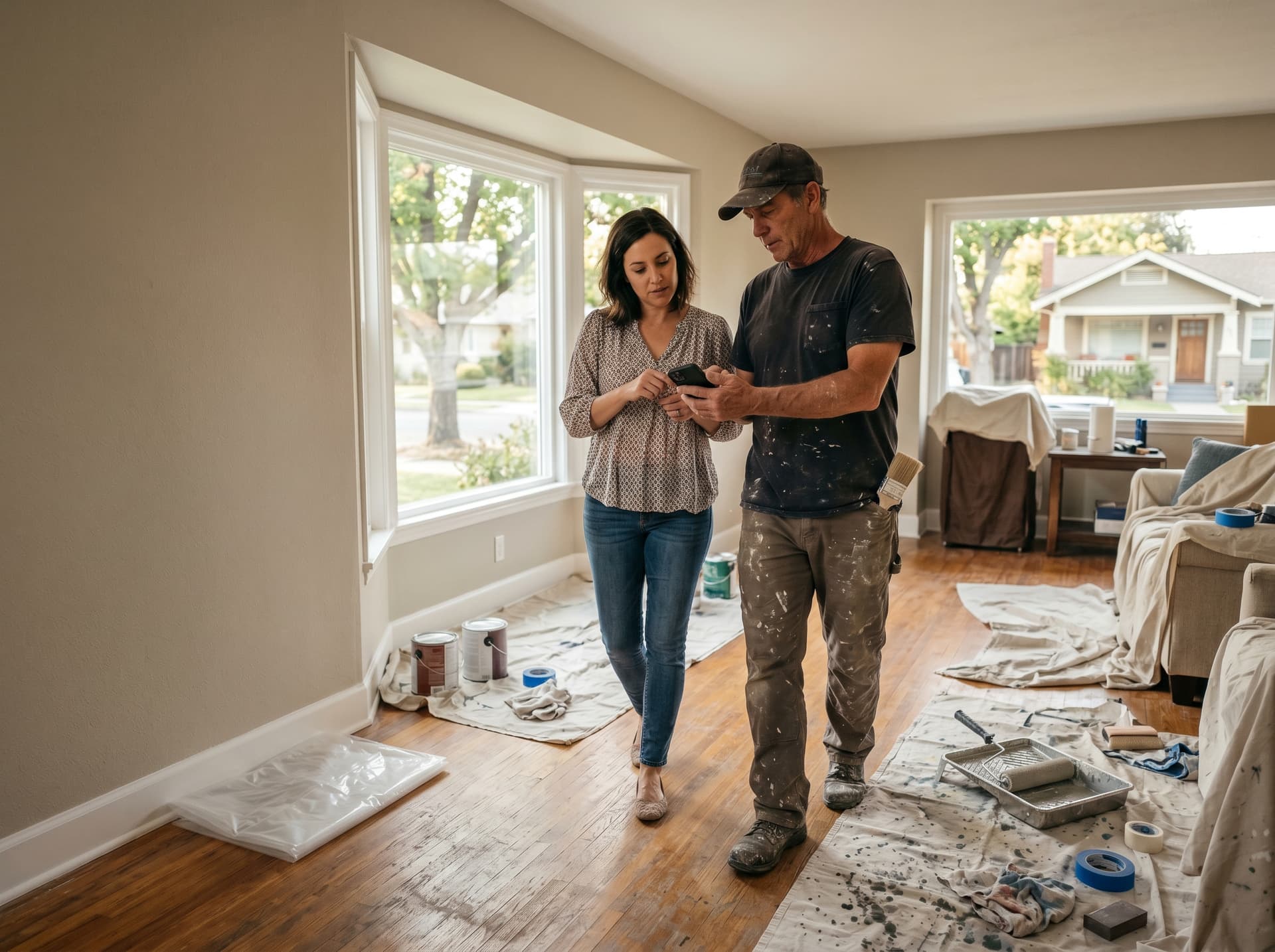
In-Home Consultation
In-home sessions start with a walkthrough of every space being painted. We evaluate natural light at that time of day, assess artificial fixture color temperature, and look at existing flooring, countertops, and furnishings before recommending color options. Large-format samples are applied directly to two or three walls per room in the actual paint product, not peel-and-stick cards. The session ends with a written color plan covering specific paint codes and sheen recommendations for every surface.
- Full room-by-room walkthrough
- Lighting and undertone analysis
- Large-format samples on actual walls
- Written color plan with codes and sheens
Virtual Consultation
Virtual sessions work well for narrowing color direction before committing to in-home samples. You submit photos and short video walkthroughs of each room with natural and artificial lighting captured, and we review them over a 45-to-60-minute video call. We identify the undertones that work in your light conditions and recommend 3 to 5 options per room to sample on your own. A follow-up review call is included after you apply samples.
- Photo and video walkthrough submission
- 45-to-60-minute video call
- 3 to 5 color options per room
- Follow-up call after samples applied
Whole-Home Palette
Whole-home palette planning requires evaluating every room and the transitions between them. Colors visible through doorways and down hallways must coordinate — a color that reads warm in the living room can look jarring when it clashes with the cooler tone in an adjacent dining room. We map out the palette room by room and confirm that undertones work together across the entire floor plan before committing to samples.
- All rooms and hallway transitions
- Sightline and flow analysis
- Coordinated undertones across floor plan
- Master palette document with all codes
Exterior Color
Exterior color selection involves evaluating the home's architectural style, roof color, landscaping, and neighboring homes before recommending body, trim, and accent combinations. For HOA-governed properties, we review the community's approved palette and prepare sample boards that meet ARC requirements. For non-HOA homes, we help navigate the wide range of options with a curated short list based on your preferences and the home's proportions.
- Body, trim, and accent color selection
- Roof and landscaping coordination
- HOA palette review if applicable
- Physical sample boards on request
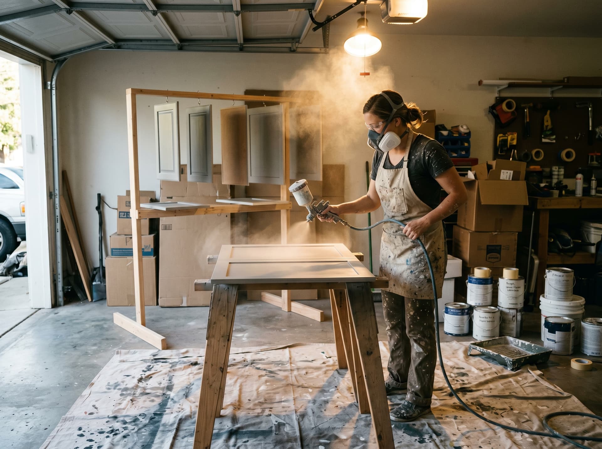
Cabinet & Trim Color
Cabinet and trim colors set the tone for the entire interior. White and off-white trim coordinates with almost any wall color, but the specific undertone — warm cream, cool bright white, or greige — makes the difference between a cohesive room and one that feels slightly off. We evaluate cabinet color options alongside wall colors, flooring, and countertops so everything reads together rather than in isolation.
- Trim color coordinated with wall palette
- Cabinet color options evaluated against countertops and flooring
- Two-tone cabinet options (uppers vs. lowers)
- Paint codes documented for painting crew
Sheen & Finish Planning
Sheen selection affects both appearance and performance. Flat and matte finishes hide wall imperfections and reduce light reflection in low-traffic areas. Eggshell and satin offer a slight sheen, easier cleaning, and are the standard for most living spaces. Semi-gloss and gloss are used on trim, doors, cabinets, and high-moisture areas like bathrooms and kitchens where the ability to wipe down surfaces repeatedly matters.
- Per-surface sheen recommendation
- Lighting and imperfection assessment
- Moisture and traffic zone guidance
- Coordinated with paint product selection
Products we use
Brands and product lines we specify in Sacramento
Sherwin-Williams
- Cashmere (interior)
- Emerald (top-line interior)
- Duration (exterior)
Sherwin-Williams' color library is one of the largest available, which makes it the default for consultation work — nearly any color direction can be matched to a product in their line. Cashmere is our standard interior recommendation; sample quarts are stocked at local stores for same-day sampling.
Benjamin Moore
- Regal Select (interior)
- Aura (top-line interior)
- Historical Colors collection
Benjamin Moore's Historical Colors and Affinity collections are particularly useful for Victorians and craftsman homes where period-appropriate palettes matter. Their color accuracy is excellent — what you see on the chip closely matches what goes on the wall.
Dunn-Edwards
- Suprema (interior)
- Evershield (exterior)
- Designer Whites collection
Dunn-Edwards' Designer Whites collection is the go-to resource when clients are navigating the overwhelming range of white and off-white options for trim and ceilings. Their Sacramento-area stores offer fast sample turnaround.
Local context
Sacramento neighborhoods and how their homes paint differently
Midtown Sacramento Victorians
Victorian homes often support 5 to 7 body, trim, and accent colors. Color consultation for these homes involves researching historically appropriate palettes while adapting them to the owner's taste. Farrow & Ball, Benjamin Moore Historical Colors, and Sherwin-Williams Westchester collections are frequently referenced.
East Sacramento Craftsman Homes
Craftsman homes look best in earthy, nature-inspired palettes — olive greens, warm taupes, creamy whites, and deep brown trim. Undertone coordination is critical here because many craftsman interiors have warm wood floors and stained woodwork that clash with cool-toned wall colors.
Folsom & El Dorado Hills New Construction
Open-plan newer homes with neutral-toned interiors and white trim are common starting points. Whole-home color planning for these homes focuses on adding warmth and personality through accent walls and coordinated paint in secondary spaces without disrupting the flow of the main living area.
Roseville & Rocklin HOA Exteriors
HOA-governed communities restrict body and trim color selections to pre-approved palettes. Our consultation for these homes includes reviewing the CC&Rs and approved color list, then curating options within those constraints that still express the homeowner's preferences.
Bay Area Peninsula
San Francisco Victorians and Palo Alto craftsman homes share the need for historically grounded color palettes that also meet local preservation guidelines. Cool-toned grays, dusty blues, and sage greens read well in the diffused Bay Area light that differs significantly from Sacramento's direct sun.

Client feedback
What Sacramento clients say
“They repainted our entire Pacific Heights home in two weeks and managed every detail. Protection and finish quality were excellent.”
“ProFlow handled our 40,000 sq ft office repaint overnight. Communication and finish quality were both solid.”
“Cabinets look factory-new. The team built a temporary spray booth and kept the rest of the home livable.”
From the blog
More on color consultation, from our blog
Best Paint Colors for 2025
The palette trends gaining traction in Sacramento-area homes — from warm neutrals to deep accent tones.
Read guide →Paint Sheen Guide for Sacramento Homes
Which finish — flat, eggshell, satin, semi-gloss — belongs on which surface and why.
Read guide →Accent Wall Ideas for Sacramento Homes
Color and placement ideas for accent walls that add depth without overwhelming the room.
Read guide →Best Paint Colors to Sell a Home in Sacramento
Neutral and near-neutral palettes that test well with the broadest range of buyers in the Sacramento market.
Read guide →
Common questions
Frequently asked questions
What do I need to prepare for a consultation?+
Have a general idea of which rooms you want to paint and any inspiration images you have collected—Pinterest boards, magazine clippings, or photos of spaces you admire. It helps if the rooms are in their normal state with typical lighting so we can evaluate conditions accurately. No need to move furniture or prep anything else; we handle the rest.
Can you coordinate colors across multiple rooms?+
Yes, and this is one of the most valuable parts of a consultation. We create a whole-home palette plan that ensures colors flow naturally from room to room, accounting for sightlines through doorways and hallways. Undertones are coordinated across the entire scheme so adjacent spaces complement each other rather than clash.
Do you provide physical samples?+
We apply large-format samples directly on your walls using the actual paint product, not peel-and-stick cards. This gives you an accurate representation of the color in your specific lighting conditions. We typically apply 2 to 3 sample options per room on different walls so you can evaluate them throughout the day before deciding.
Can you consult virtually?+
Yes. Virtual consultations work well for initial color direction and narrowing options. You send us photos and videos of your rooms with natural and artificial lighting, and we conduct the session over video call. For final color confirmation, we recommend applying physical samples on your walls and sharing photos with us for a follow-up review before committing.
How do you help with sheen selection?+
Sheen affects both the look and function of a painted surface. We recommend flat or matte for ceilings and low-traffic rooms, eggshell or satin for living areas and bedrooms (easy to clean without excessive shine), and semi-gloss for trim, doors, bathrooms, and kitchens where moisture resistance matters. We also consider how sheen interacts with your lighting—glossier finishes amplify imperfections on older walls.
Is consultation credit applied toward painting services?+
Yes. The full consultation fee is applied as a credit toward your painting project when you book with ProFlow. This means the consultation is effectively free when you move forward with us. If you decide not to proceed with painting, the consultation fee covers the time, expertise, and written color plan you received.
Ready when you are
Talk with a color specialist
Share inspiration boards or mood photos—our team will guide selections.