

Choosing the right exterior paint color for your California home is about more than aesthetics. Your home's exterior must withstand intense UV rays, temperature fluctuations, and still look stunning year after year. The best exterior paint colors balance timeless appeal with California's unique architectural styles and climate demands. Whether you're preparing to sell or simply want to refresh your home's curb appeal, this comprehensive guide covers the top exterior color schemes, expert recommendations, and practical considerations for Sacramento and throughout California. From Mediterranean villas to modern farmhouses, discover how to select colors that enhance your home's value and stand the test of time.
Top Exterior Paint Colors for 2026
The best exterior paint colors for California homes in 2026 blend timeless neutrals with warm, earthy undertones that complement our golden state's natural landscape. Here are the trending palettes that professional painters recommend.
Warm Whites & Creams
Warm whites remain the gold standard for California home exteriors, offering versatility and broad appeal. These colors reflect heat while maintaining elegance.
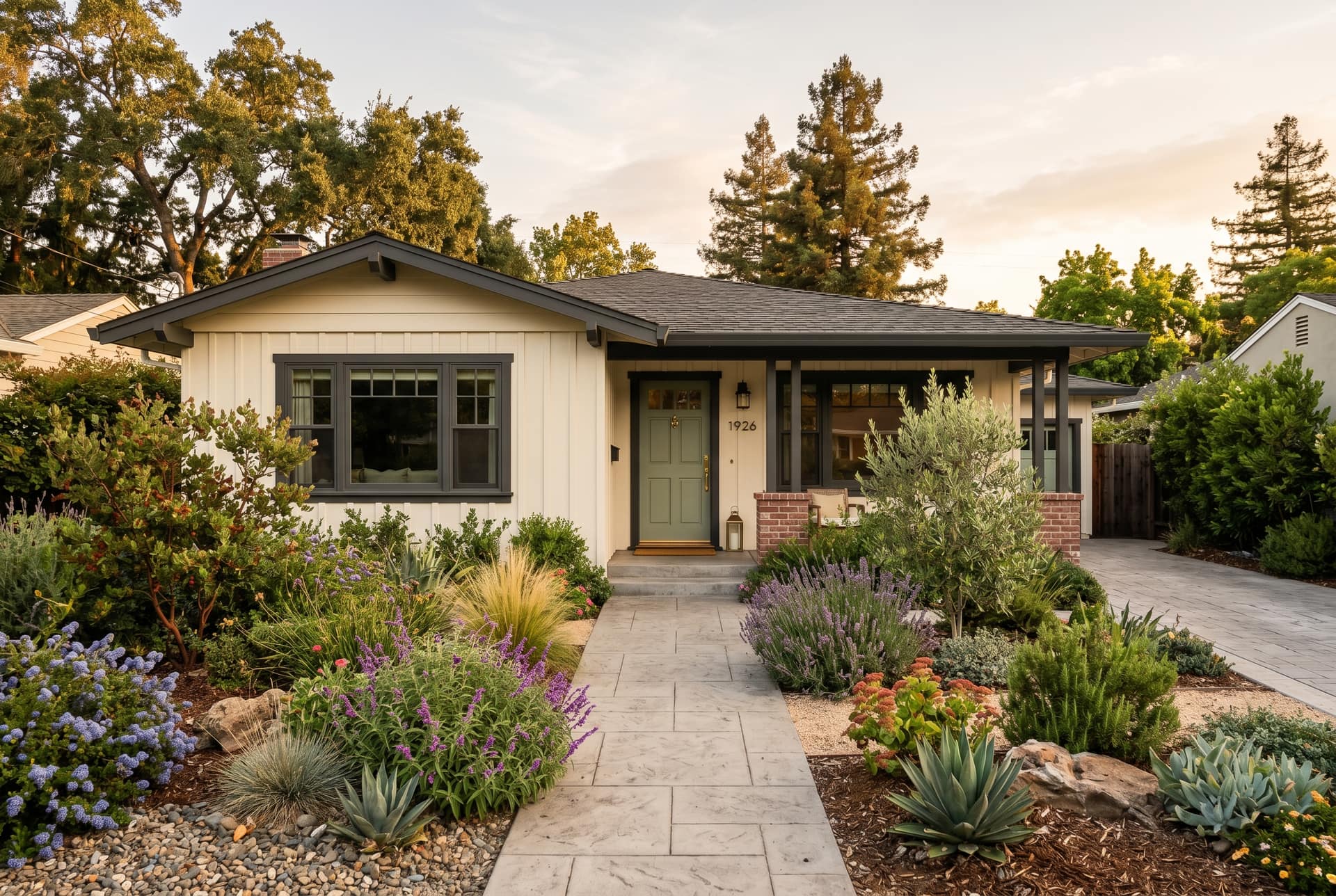
Sherwin-Williams Alabaster (SW 7008) leads as the most popular warm white. This creamy white has subtle beige undertones that prevent the stark, sterile appearance of pure white. It pairs beautifully with darker trim colors like Sherwin-Williams Tricorn Black (SW 6258) or warm wood tones. Alabaster works exceptionally well on Craftsman-style homes and modern farmhouses.
Benjamin Moore Swiss Coffee (OC-45) offers slightly more warmth than Alabaster, making it ideal for Mediterranean and Spanish Revival homes. The gentle yellow undertone creates a welcoming, sun-kissed appearance that complements terracotta roofs and stone accents.
Sherwin-Williams Pure White (SW 7005) provides a crisp, clean look for contemporary homes. While cooler than Alabaster, it still maintains enough warmth to avoid appearing clinical. Use this on modern architecture with clean lines and minimal ornamentation.
Benjamin Moore White Dove (OC-17) strikes the perfect balance between warm and cool. This versatile shade adapts to different lighting conditions, appearing softer in shade and brighter in direct sunlight. It's particularly effective on homes with complex architectural details.
Soft Grays & Greiges
Gray and greige (gray-beige hybrid) exterior colors dominate California neighborhoods, offering sophisticated neutrality with remarkable versatility.
Sherwin-Williams Repose Gray (SW 7015) ranks as the most popular gray for house exteriors. This true gray has slight warm undertones that prevent it from looking cold or industrial. Pair with bright white trim (SW Pure White) and black accents for a modern, high-contrast look that boosts curb appeal.
Benjamin Moore Revere Pewter (HC-172) is the ultimate greige. This warm gray-beige blend works on virtually any architectural style. The color shifts beautifully throughout the day, appearing more gray in morning light and warmer beige in afternoon sun. It's particularly stunning on Craftsman homes with stone foundations.
Sherwin-Williams Agreeable Gray (SW 7029) offers more beige warmth than Repose Gray. This color creates a soft, approachable exterior that appeals to broad buyer demographics. Use on ranch-style homes and traditional two-stories for maximum resale value.
Benjamin Moore Stonington Gray (HC-170) provides a cooler, more sophisticated gray option. This shade works beautifully in coastal areas and on contemporary homes. Pair with crisp white trim and natural wood accents for a refined coastal aesthetic.
Earthy Tones
California's natural landscape inspires exterior colors that echo desert sands, coastal cliffs, and golden hills.
Sherwin-Williams Accessible Beige (SW 7036) captures California's warm, earthy essence. This neutral beige has subtle gray undertones that keep it from appearing yellow or dated. It's the perfect backdrop for colorful landscaping and complements both traditional and transitional architecture.
Benjamin Moore Grant Beige (HC-83) offers richer warmth ideal for Mediterranean and Tuscan-style homes. This toasted beige pairs beautifully with terracotta accents, wrought iron details, and lush greenery.
Sherwin-Williams Tony Taupe (SW 7038) brings sophisticated earthiness with its balanced gray-brown blend. This color works exceptionally well on larger homes where true gray might feel cold. Combine with cream trim and black window frames for contemporary elegance.
Benjamin Moore Shaker Beige (HC-45) provides a lighter earthy option that reflects heat while maintaining warmth. This versatile shade works on Spanish Colonial, ranch, and farmhouse styles throughout California.
Bold Statement Colors
While neutrals dominate, carefully chosen bold colors create memorable curb appeal when executed properly.
Sherwin-Williams Naval (SW 6244) has emerged as the go-to deep blue for dramatic exteriors. This rich navy blue works on Victorian homes, modern farmhouses, and contemporary designs. Pair with crisp white trim and brass or black hardware for stunning contrast.
Benjamin Moore Hale Navy (HC-154) offers a slightly softer navy option that reads as sophisticated rather than stark. Use on Colonial and Craftsman homes for timeless elegance.
Sherwin-Williams Iron Ore (SW 7069) provides a charcoal-gray statement that's bold yet neutral enough for broad appeal. This color creates striking modern exteriors when paired with natural wood and white accents.
Benjamin Moore Gentleman's Gray (N-500) delivers a deep, warm gray that adds gravitas without overwhelming. This sophisticated shade works particularly well on larger estates and executive homes.
Best Colors by Home Style
Selecting exterior paint colors that complement your home's architectural style creates cohesion and enhances inherent design features. Here's how to match colors to California's most common home styles.
Mediterranean & Spanish Revival
Mediterranean and Spanish Revival homes dominate California's architectural landscape, requiring colors that honor their historical roots while meeting modern tastes.
Traditional stucco exteriors look stunning in warm, earthy tones. Benjamin Moore Adobe Sand (2175-50) and Mexican Tile (1194) capture authentic Spanish warmth. For trim, use Swiss Coffee (OC-45) or White Dove (OC-17) to create subtle contrast. Window frames in Bronze or Dark Chocolate maintain historical accuracy.
Contemporary interpretations favor cooler neutrals like Sherwin-Williams Kilim Beige (SW 6106) or Benjamin Moore Shaker Beige (HC-45) paired with crisp white trim. This modernizes the style while respecting traditional forms.
Accent colors should reference terracotta, aged bronze, and Mediterranean blues. Use Sherwin-Williams Moroccan Brown (6060) for doors or Benjamin Moore Ocean Floor (1630) for shutters to add character without overwhelming.
Modern & Contemporary
Modern and contemporary homes showcase clean lines and minimalist aesthetics that demand sophisticated color palettes.
Monochromatic schemes work beautifully. Paint the entire exterior in Sherwin-Williams Repose Gray (SW 7015) with trim in Extra White (SW 7006) and windows in Tricorn Black (SW 6258) for maximum impact. This high-contrast approach emphasizes architectural geometry.
Warm minimalism uses Benjamin Moore Balboa Mist (OC-27) for body color with Chantilly Lace (OC-65) trim. This softer approach creates modern elegance without austerity.
Bold modern statements feature dark exteriors like Sherwin-Williams Peppercorn (SW 7674) or Iron Ore (SW 7069) with natural wood accents and white window frames. These dramatic choices work best on larger modern homes with distinctive architecture.
Craftsman & Bungalow
Craftsman homes feature detailed woodwork and natural materials requiring colors that highlight rather than hide architectural features.
Classic Craftsman palettes use earthy body colors like Sherwin-Williams Latte (SW 6108) or Benjamin Moore Wilmington Tan (HC-34) with darker trim in Sherwin-Williams Urbane Bronze (SW 7048) or Benjamin Moore Amazon Soil (2115-30). This traditional approach emphasizes horizontal lines and overhanging eaves.
Contemporary Craftsman updates use Sherwin-Williams Agreeable Gray (SW 7029) for siding with Repose Gray (SW 7015) trim and Naval (SW 6244) door. This modern interpretation maintains Craftsman character while appealing to current aesthetics.
Accent colors should reference nature. Use deep greens, burgundy, or ochre on doors, shutters, or decorative brackets. Benjamin Moore Hunter Green (2041-10) or Caliente (AF-290) add appropriate character.
Ranch Style
Ranch-style homes benefit from colors that emphasize their horizontal lines and connection to landscape.
Neutral ranch exteriors in Benjamin Moore Revere Pewter (HC-172) or Sherwin-Williams Accessible Beige (SW 7036) create timeless appeal. Pair with white trim and black or dark bronze window frames for updated mid-century modern aesthetics.
Warm ranch colors like Sherwin-Williams Kilim Beige (SW 6106) or Benjamin Moore Grant Beige (HC-83) complement natural wood accents and landscaping. Use slightly darker garage doors to create visual interest.
Contemporary ranch updates feature Sherwin-Williams Cityscape (SW 7067) or Benjamin Moore Kendall Charcoal (HC-166) for dramatic modern transformations. Balance dark exteriors with ample white trim and natural materials.
Farmhouse
Modern farmhouse style has exploded in popularity, requiring colors that balance rustic charm with contemporary refinement.
Classic farmhouse white uses Sherwin-Williams Alabaster (SW 7008) or Benjamin Moore Decorator's White (OC-149) for bright, fresh exteriors. Pair with black window frames, dark roof, and natural wood accents for authentic farmhouse appeal.
Warm farmhouse palettes feature Sherwin-Williams Canvas Tan (SW 7531) or Benjamin Moore Muslin (OC-12) with crisp white trim. This softer approach works well in suburban settings while maintaining farmhouse character.
Dark farmhouse drama uses Sherwin-Williams Iron Ore (SW 7069) or Urbane Bronze (SW 7048) for statement exteriors. Balance with generous white trim, board-and-batten siding details, and metal roofing for modern farmhouse impact.
Colors That Boost Resale Value
Strategic color selection significantly impacts home resale value and buyer appeal. Understanding what colors attract buyers helps maximize return on your painting investment.
Real estate data consistently shows neutral exterior colors command higher resale values and sell faster. Homes painted in shades of white, gray, beige, and greige typically sell for 1-3% more than similar homes in bold or outdated colors.
Top resale colors include:
- Sherwin-Williams Alabaster (SW 7008): The warm white we see requested most often for resale repaints
- Benjamin Moore Revere Pewter (HC-172): The most requested greige for resale preparations
- Sherwin-Williams Repose Gray (SW 7015): Modern gray with universal appeal
- Benjamin Moore White Dove (OC-17): Soft white that photographs beautifully in listings
Colors that decrease value include bright yellows, purples, and unconventional combinations. Homes with polarizing color choices tend to sit on market longer and draw lower offers.
The neutral vs. bold debate comes down to market and home type. In competitive sellers' markets, well-executed bold colors can differentiate your property. Sherwin-Williams Naval (SW 6244) on a Victorian or Craftsman creates memorable appeal. However, in buyers' markets, stick with proven neutrals to avoid limiting your buyer pool.
Trim and accent strategy matters as much as body color. High-contrast combinations (white body with black trim or vice versa) consistently outperform low-contrast monochromatic schemes in buyer appeal. This contrast makes homes appear more expensive and well-maintained.
Consider your neighborhood context. If surrounded by beiges and tans, a sophisticated gray like Sherwin-Williams Cityscape (SW 7067) provides distinction without alienation. The goal is standing out positively, not being the neighborhood outlier.
Regional preferences affect resale values. In our experience repainting homes across the Sacramento market, buyers here lean toward warm neutrals over cool grays, while coastal California skews toward cooler palettes. Work with local real estate professionals to understand your specific market.
California Climate Considerations
California's intense sun, low humidity, and temperature swings demand exterior colors and finishes engineered for durability and energy efficiency.
UV fade resistance is critical for maintaining color integrity. Dark, saturated colors fade fastest under California's intense UV exposure. If choosing bold colors like Sherwin-Williams Naval (SW 6244) or Urbane Bronze (SW 7048), invest in premium paint with advanced UV inhibitors. Sherwin-Williams Emerald Exterior and Benjamin Moore Aura Exterior offer superior fade resistance worth the premium cost.
Earth tones and neutrals fade more gracefully. Sherwin-Williams Accessible Beige (SW 7036) and Repose Gray (SW 7015) hold their color noticeably better than deep blues or reds over multi-year periods in California climates.
Heat reflection directly impacts energy costs and interior comfort. Light colors reflect 60-80% of solar heat, while dark colors absorb 70-90%. Homes painted in Benjamin Moore White Dove (OC-17) or Sherwin-Williams Alabaster (SW 7008) maintain 8-12 degrees cooler exterior surface temperatures than dark alternatives.
This doesn't eliminate dark color options. Modern cool-color technology in premium paints includes infrared-reflective pigments that reflect heat while maintaining dark appearance. Sherwin-Williams VinylSafe colors and Benjamin Moore Aura Exterior in dark shades perform significantly better than standard formulations.
Best finishes for sun exposure balance durability with appearance:
- Satin finish (30-40 sheen) provides optimal durability for California exteriors. It hides minor imperfections while offering excellent washability and fade resistance.
- Flat finish (0-5 sheen) works on stucco and textured surfaces where sheen would highlight imperfections, but requires more frequent repainting.
- Semi-gloss (50-65 sheen) performs best on trim, doors, and high-moisture areas, offering maximum durability and cleanability.
Stucco-specific considerations matter for California's prevalent exterior finish. Use elastomeric or masonry paint formulated for stucco's alkalinity and texture. These specialized formulas prevent cracking, peeling, and moisture intrusion that standard paints can't address.
Coastal environments require additional considerations. Salt air accelerates paint degradation. Homes within five miles of coastline benefit from marine-grade paints with enhanced mildew resistance and salt-air durability. Benjamin Moore MoorGard and Sherwin-Williams SuperPaint Exterior perform excellently in coastal conditions.
Sacramento & Placer County
Need a real quote on your project?
Free, no-obligation walkthrough. Itemized estimate within 24 hours. Most jobs scheduled within 2–3 weeks.
Exterior Color Scheme Formulas
Creating cohesive exterior color schemes requires understanding the body-trim-accent formula and how to coordinate with your home's fixed elements.
The 60-30-10 Rule provides foolproof color balance:
- 60% Body Color: Your primary siding or stucco shade (Sherwin-Williams Accessible Beige)
- 30% Trim Color: Windows, fascia, columns (SW Pure White)
- 10% Accent Color: Front door, shutters, decorative details (SW Naval)
This proven formula creates visual interest without overwhelming. Apply it whether choosing monochromatic schemes or contrasting palettes.
High-Contrast Combinations create striking modern appeal:
- Light body + dark trim: Benjamin Moore White Dove (OC-17) + Kendall Charcoal (HC-166)
- Dark body + light trim: Sherwin-Williams Iron Ore (SW 7069) + Extra White (SW 7006)
- Gray body + black accents: SW Repose Gray (7015) + Tricorn Black (6258) + white trim
These dramatic combinations test highest in curb appeal surveys and attract design-conscious buyers.
Monochromatic Sophistication uses varying shades of one color:
- Body: Sherwin-Williams Agreeable Gray (SW 7029)
- Trim: SW Repose Gray (SW 7015) - one shade darker
- Accents: SW Cityscape (SW 7067) - two shades darker
- Door: SW Peppercorn (SW 7674) - dramatic dark
This subtle approach creates depth while maintaining cohesion. It works beautifully on modern and contemporary architecture.
Coordinating with Fixed Elements ensures your color scheme complements unchangeable features:
Roof Color Coordination:
- Brown/tan roofs: Warm neutrals like Benjamin Moore Shaker Beige (HC-45) or Sherwin-Williams Kilim Beige (SW 6106)
- Gray roofs: Cool grays like SW Repose Gray (7015) or warm grays like BM Revere Pewter (HC-172)
- Black roofs: Nearly any color works; maximize contrast with light bodies
- Red/terracotta roofs: Mediterranean earths like BM Adobe Sand or SW Kilim Beige
Stone and Brick Accents: Pull colors from natural stone or brick. If you have gray stone, use Sherwin-Williams Agreeable Gray (SW 7029) to echo tones. With warm brick, choose Benjamin Moore Grant Beige (HC-83) to complement rather than compete.
Landscaping Integration: Consider permanent landscaping. Desert landscaping pairs with warm earth tones. Lush green yards provide enough color contrast to support neutral exteriors that won't compete.
Neighborhood Harmony: Survey surrounding homes. You want distinction, not disruption. If neighbors favor warm beiges, a sophisticated gray like Sherwin-Williams Repose Gray (SW 7015) differentiates without clashing. Avoid being the only bold-colored home on a neutral street unless you're confident in the choice.
Testing Before Committing: Purchase sample quarts and paint 2x2-foot sections on different elevations. Observe morning, afternoon, and evening light for three days. Colors shift dramatically in varying light conditions. What looks perfect in the paint store may appear entirely different on your north-facing facade.
Colors to Avoid
Certain exterior paint colors create challenges for resale, maintenance, or aesthetic longevity. Understanding what to avoid prevents costly mistakes.
Overly Trendy Colors date your home quickly. The millennial pink and peacock blue trends of 2018-2020 now signal dated taste. What feels fresh today may look tired in three years. Bold colors work only when they complement architectural style authentically, not chase temporary trends.
Bright Primary Colors (fire engine red, bright yellow, royal blue) limit buyer appeal and violate many HOA restrictions. These attention-grabbing shades work on commercial buildings but rarely succeed on residential exteriors. Even if permitted, they significantly narrow your resale market.
Orange and Rust Tones read as dated 1970s aesthetics unless you're restoring a legitimate mid-century property. Sherwin-Williams colors in the orange family (Harvest Gold, Butterscotch) should be avoided for mainstream appeal.
Purple in Any Shade tests lowest in buyer appeal surveys. While a Victorian painted lady can pull off authentic historical purples, conventional homes painted purple sit on market significantly longer. This applies to lavenders, mauves, and deeper eggplants equally.
Stark White without warm undertones appears cold, institutional, and shows every imperfection. True white (Sherwin-Williams High Reflective White) looks appropriate on trim but overwhelming as a body color. Choose warm whites like Alabaster (SW 7008) or Swiss Coffee (BM OC-45) instead.
Very Dark Colors on Small Homes create a cave-like effect that makes properties appear smaller. While Sherwin-Williams Iron Ore (SW 7069) looks stunning on 3,500+ square foot homes with ample white trim, it overwhelms 1,200 square foot bungalows. Reserve dark colors for larger homes with architectural presence to carry the weight.
Mismatched Undertones create subtle discord. Pairing cool gray (Sherwin-Williams Passive) with warm beige trim generates visual tension. Stick within color temperature families: warm with warm, cool with cool.
HOA Restriction Violations cause expensive do-overs. Review your HOA's architectural guidelines before purchasing paint. Many California communities restrict color palettes to specific ranges or require pre-approval. Repainting due to violations wastes money and time.
Resale Risk Colors include any highly personalized choices that reflect individual taste over market appeal. Your favorite sage green may appeal to you but alienate 70% of potential buyers. If selling within five years, prioritize market preferences over personal preference.
Popular Sacramento Neighborhood Palettes
Sacramento's diverse neighborhoods each have distinct architectural characters and color preferences. Choosing colors that complement your specific area enhances neighborhood cohesion and property values.
East Sacramento Traditional
East Sacramento's historic neighborhoods feature predominantly Craftsman, Tudor, and Colonial Revival homes built 1920-1950. Color palettes respect historical authenticity while allowing contemporary updates.
Traditional East Sac favors warm, earthy neutrals. Benjamin Moore Wilmington Tan (HC-34), Grant Beige (HC-83), and Shaker Beige (HC-45) dominate, paired with cream or white trim. These honor the neighborhood's historical character while maintaining broad appeal.
Craftsman-specific palettes use Sherwin-Williams Latte (SW 6108) or Renwick Beige (SW 2805) for body, Urbane Bronze (SW 7048) for trim, and Hunter Green (BM 2041-10) or Caliente (BM AF-290) accents. This traditional three-color Craftsman approach enhances architectural detail.
Updated traditional homes use sophisticated grays like Sherwin-Williams Agreeable Gray (SW 7029) or Benjamin Moore Revere Pewter (HC-172) to modernize while respecting context. Pair with crisp white trim and black accents for contemporary elegance that doesn't clash with neighbors.
Midtown Eclectic
Midtown Sacramento embraces diverse architectural styles and more adventurous color choices. Victorian painted ladies share blocks with modern infills, creating permissive color environments.
Victorian restorations authentically use multiple coordinated colors. Body in Benjamin Moore White Dove (OC-17), trim in Balboa Mist (OC-27), and accents in Hale Navy (HC-154) with door in Caliente (AF-290) creates appropriate Victorian character without overwhelming modern sensibilities.
Modern infill homes often choose bold statements like Sherwin-Williams Naval (SW 6244), Iron Ore (SW 7069), or Urbane Bronze (SW 7048) with white trim. These contemporary choices contrast architecturally with surrounding historics while respecting the eclectic neighborhood character.
Eclectic bungalows work with nearly any well-executed palette. Sophisticated combinations like Benjamin Moore Gray Owl (OC-52) body with Hale Navy (HC-154) door and white trim create distinctive appeal that fits Midtown's creative atmosphere.
Suburb-Friendly Neutrals
Sacramento suburbs (Elk Grove, Natomas, Folsom) feature newer construction with HOA restrictions requiring conservative color palettes.
Safest suburban choices include Sherwin-Williams Accessible Beige (SW 7036), Repose Gray (SW 7015), and Alabaster (SW 7008). These nearly always receive HOA approval while maintaining strong resale appeal.
Permitted variations might include Benjamin Moore Stonington Gray (HC-170) or Sherwin-Williams Agreeable Gray (SW 7029) for slightly more character within neutral parameters. Always verify against HOA-approved color lists before purchasing.
Suburban accents typically limit to doors and small details. A front door in Sherwin-Williams Naval (SW 6244) or Benjamin Moore Hunter Green (2041-10) adds personality without triggering HOA concerns. Garage doors should match or closely coordinate with body color.
Newer development consistency matters in tract home communities. While you want some distinction, dramatically different colors disrupt visual harmony and may affect neighborhood property values. Choose the most sophisticated option within your development's established palette range.
Rancho Cordova & Sunridge
Sunridge — including Sunridge Park, Anatolia, and Stone Creek in Rancho Cordova — is one of the Sacramento region's largest newer master-planned areas, and its stucco exteriors take some of the most intense, unshaded valley sun in the metro. Exterior paint colors here need to do two jobs: pass the HOA's architectural review and survive years of UV exposure on young trees' worth of unshaded elevations.
Sunridge-safe palettes center on warm, light-to-medium neutrals that reflect heat and resist fade: Sherwin-Williams Accessible Beige (SW 7036), Agreeable Gray (SW 7029), and Alabaster (SW 7008) all sit comfortably within typical Sunridge-area approved schemes. Pair with slightly darker trim in the same temperature family and reserve contrast for the front door — Sherwin-Williams Naval (SW 6244) or Urbane Bronze (SW 7048) add character without triggering a resubmittal.
Avoid dark body colors on these mostly tree-less lots. Dark stucco in full Rancho Cordova sun fades unevenly on south and west elevations and runs hotter, which shortens repaint cycles. If you want depth, use it on shutters, garage doors, or entry doors instead.
Submit body, trim, and accent samples to your HOA together, and confirm the scheme against the community's approved palette before buying paint. We handle exterior painting in Rancho Cordova and Sunridge regularly and can prepare HOA submission packets as part of the project.
FAQ
What is the most popular exterior house color in California?
Warm gray-beige tones (greige) currently rank as California's most popular exterior colors. Sherwin-Williams Agreeable Gray (SW 7029) and Benjamin Moore Revere Pewter (HC-172) lead in both residential painting projects and new construction. These versatile neutrals complement California's architectural diversity, perform well in our climate, and appeal to broad buyer demographics. Warm whites like Sherwin-Williams Alabaster (SW 7008) run a close second, particularly in coastal areas and on Spanish-style homes. The trend reflects homeowners' preference for timeless neutrals that enhance landscaping and architectural features rather than compete with them.
What exterior colors make a house look expensive?
High-contrast color combinations create the perception of higher value and quality. A sophisticated scheme like crisp white body (Benjamin Moore White Dove OC-17) with black window frames (Sherwin-Williams Tricorn Black SW 6258) and dark charcoal door (BM Kendall Charcoal HC-166) signals contemporary luxury. Alternatively, dark sophisticated exteriors in Sherwin-Williams Iron Ore (SW 7069) or Naval (SW 6244) with generous white trim project executive presence. The key is high-quality paint application with clean lines, consistent finish, and attention to detail. Well-maintained landscaping and updated hardware amplify the expensive appearance that strategic color creates.
Should exterior house colors be light or dark in California?
Light to medium colors generally perform better in California's sunny climate. Light exteriors reflect 60-80% of solar heat, reducing cooling costs and preventing heat-related paint degradation. Sherwin-Williams Alabaster (SW 7008), Accessible Beige (SW 7036), and Repose Gray (SW 7015) offer practical benefits beyond aesthetics. However, dark colors work successfully with proper planning. Premium paints with cool-color technology (infrared-reflective pigments) allow dark exteriors like Sherwin-Williams Iron Ore (SW 7069) without excessive heat absorption. Consider your home's size, shade coverage, and air conditioning capacity. Large homes with mature trees can handle dark colors better than small homes in full sun.
What is the best paint finish for exterior walls in California?
Satin finish (30-40 sheen level) performs best for California exterior walls, offering optimal balance between durability and appearance. This finish hides minor surface imperfections while providing excellent UV resistance, dirt resistance, and washability. Sherwin-Williams Emerald Exterior Satin and Benjamin Moore Aura Exterior Satin deliver superior performance in California's intense sun. For smooth stucco, low-sheen satin works beautifully. For heavily textured stucco, flat or matte finish prevents sheen inconsistencies that highlight texture variations. Reserve semi-gloss (50-65 sheen) for trim, doors, railings, and high-moisture areas where maximum durability matters most.
How often should I repaint my house exterior in California?
California homes require exterior repainting every 7-12 years depending on paint quality, color choice, sun exposure, and surface preparation. Premium paints like Sherwin-Williams Emerald or Benjamin Moore Aura can last 10-12 years with proper application. Standard-quality paints typically require refreshing at 7-8 years. Dark colors fade faster, potentially needing touch-ups at 5-7 years. South and west-facing elevations receiving direct afternoon sun degrade 30% faster than shaded north sides. Coastal locations require more frequent maintenance due to salt air exposure. Proper surface preparation, primer application, and using two finish coats dramatically extend paint longevity. Budget accordingly and inspect annually for early signs of chalking, fading, or peeling.
Do I need HOA approval for exterior paint colors?
Most California HOAs require architectural approval before changing exterior colors. Review your CC&Rs (Covenants, Conditions & Restrictions) and architectural guidelines before purchasing paint. Typical HOA requirements include:
- Submitting color samples or paint codes for approval
- Using pre-approved color palettes specific to your community
- Maintaining color schemes consistent with neighborhood character
- Waiting 7-30 days for architectural committee review
Consequences of painting without approval include mandatory repainting at your expense, fines ranging from $100-500, and potential liens against your property. Even if your color choice seems conservative, follow proper channels. Submit samples of body, trim, and accent colors simultaneously to avoid multiple approval cycles. Some HOAs pre-approve specific Sherwin-Williams or Benjamin Moore colors, streamlining the process considerably.
Get Expert Color Consultation
Choosing the perfect exterior paint colors for your California home doesn't have to be overwhelming. ProFlow Painting offers complimentary color consultations to help you select colors that enhance your home's architecture, suit your style, and maximize resale value.
Our professional painters bring extensive experience with California's diverse architectural styles and climate demands. We help coordinate body, trim, and accent colors while ensuring your choices comply with HOA requirements and neighborhood aesthetics. We test colors on your actual exterior surfaces, observe them in different lighting conditions, and provide expert recommendations based on your home's unique characteristics.
Contact ProFlow Painting at (916) 740-7249 for your free exterior color consultation. We serve Sacramento and surrounding areas with premium painting services that transform homes while protecting your investment. Let our color expertise and professional application create the stunning exterior your home deserves. Budgeting the project? See our exterior painting cost guide for 2026 price tables by siding type and home size, or our broader Sacramento house painting cost guide for full interior and exterior ranges. Ready to get a number on your project? Get a free painting quote online.
Ready to transform your home's curb appeal? Call (916) 740-7249 or visit our website to schedule your complimentary consultation. ProFlow Painting delivers solid results that stand up to California's climate while turning heads in your neighborhood.
Free quote · Sacramento & Placer County
Ready for a real estimate, not a guess?
Tell us about your project and we'll walk it with you in person. Itemized quote within 24 hours, no high-pressure sales.